Sunday 30 June 2013

How Technology Affects Human——Final Project

Summary


Technology has been influencing our life and bringing a lot of death for a very long time. Since the invention of bomb and tank, the World War I has been started. Since the invention of atomic bomb, the World War II has been ended, however bringing an unexpected sequel to Hiroshima and Nagasaki also. Therefore, I have done my research more focus on technology and weapons.

Due to the advance of technology, a lot of weapons were being invented. People are using many kinds of weapons such as gun, bomb, atomic bomb, and even virus to start the war. It caused almost 90 millions people died between World War I and World War II. Apart from that, according to NBCNews.com (2013), there is an average of more than 100,000 people being shot in the U.S. every year because of the gun possession laws. Besides, the Boston Marathon Explosion caused at least 144 people being treated, with at least 17 of them in critical condition and 25 in serious condition. Also, at least eight of the patients are children.

Therefore from the data above, we can simply see that there is a close relationship between death and the invention of weapons. 


Sketch


Design Process


Step 1:

Sketch and draw on a piece of A4 size paper. Next, scan it into the computer with 600 dpi and colour mode. Open up drawing in photoshop and resize the picture to 420mm x 594mm A2 size and resolution of 300 pixels.


Step 2:

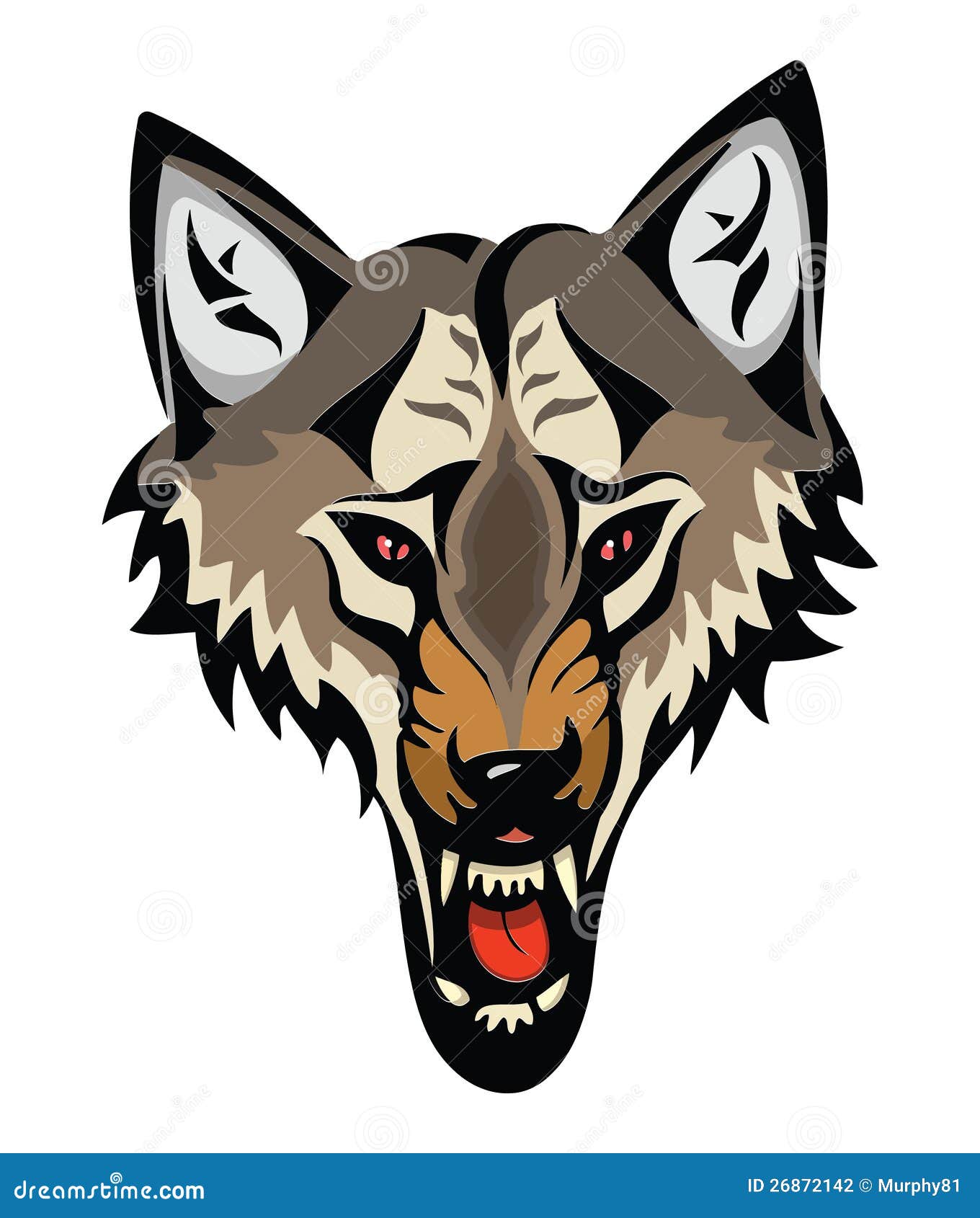
Start off with the wolf's face. Use brush tool and nine different tone of colours to make the wolf looks more real and solid.


Step 3:

Colour the wolf's hand and neck with black, dark brown and light brown. To make the wolf looks more evil and bloody, adding black and red colour and change the brush tool's pattern to the circle below. Also, the wound should be put on more patience when colouring. 


Step 4:

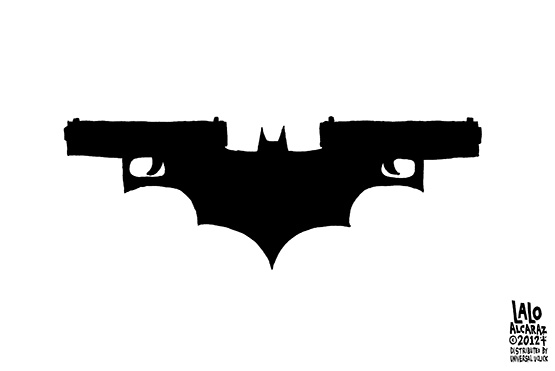
Start colouring the shirt. To make the shirt more harmonious with face and hand, I choose the colours which as similar as the hand's colour. Also, colouring the dark knight gun with black colour and using brush tool to draw a puddle of blood on "shooting" word.


Step 5:

Colour the nuclear bombing with dark orange, red, and brown colours. Next, I'm using black colour with a very low opacity to make a shadow. Later, colour the machine gun with grey and dark grey; and the fire with red and a bit orange. 


 Step 6:

As for the blood, I did not draw the outline for it. Therefore for making it more 3D, I will add Drop Shadow for it.


Step 7:

Start colouring the left items. Because of the feeling I want to express is death, therefore the colours I use will more tend to be dull and dark.


Step 8:

Colour the background with yellow, orange, brown, and black colours to show an explosion. Later, adjust the overall colour to make it more harmonious. Besides, I erase the nuclear bombing's outline to make it more natural. Also, I do a bit changes in the "Boston Marathon" banner and dark knight gun to make them different with the original images. 


Final Artwork


Artists Statement


The artwork displayed above showcases what I perceive about the relationship between technology and death. Besides, it also showcases what I imagine about the explosion scene during the World War II. Death is dreadful and war is bloody, therefore I prefer using a lot of darker colours. Also, I apply the current issues such as Boston Marathon Bombing and Dark Knight Colorado Shooting in my artwork because I think that art should not only be an art, but can reflect the society and the world. Using the wolf as the man’s face because I think that human is greedy and selfish as wolf. They love power and regard others people life as nothing. Therefore, my artwork will show you not only the relationship between technology and death but also the ugly fact of human’s life.


References


Levs, J., & Plott, M. (2013). Boy, 8, one of 3 killed in bombings at Boston Marathon; scores wounded. CNN. Retrieved from http://edition.cnn.com/2013/04/15/us/boston-marathon-explosions

NBCNews.com. (2013). Just the facts:Gun violence in America. Retrieved from http://usnews.nbcnews.com/_news/2013/01/16/16547690-just-the-facts-gun-violence-in-america?lite

Banner——http://blogs.denverpost.com/opinion/files/2013/04/boston-bombing-cartoon-sack.jpg

Biochemical Logo——http://livingwithra.files.wordpress.com/2009/12/376px-biohazard_symbol_red_svg1.jpg

Dark Knight Gun——http://pocho.com/wp-content/uploads/2012/07/Dark-Knight-copy1.jpg

Machine Gun——http://image.shutterstock.com/display_pic_with_logo/370372/370372,1253253778,1/stock-vector-vector-illustration-of-a-machine-gun-black-and-white-37249819.jpg

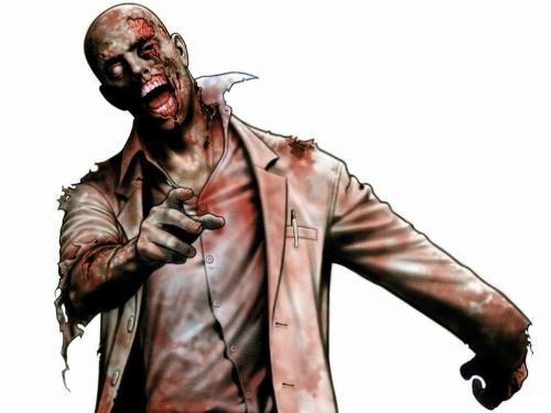
Man——http://pic.baike.soso.com/p/20090917/20090917142932-1904179279.jpg

Nuclear Bomb——http://i.istockimg.com/file_thumbview_approve/7121608/2/stock-illustration-7121608-nuclear-explosion.jpg

Tank——http://newsimg.ngfiles.com/40000/40852_baflash_tank.jpg

Wolf——http://thumbs.dreamstime.com/z/cartoon-angry-wolf-head-26872142.jpg

How Technology Affects Human——Five Sketches

1. The Slaves Of Technology


2. Travel Is Possible!


3. Death And War


4. Homeless


5. Silence Of Love


Monday 17 June 2013

National Art Gallery——Caged For Show

Can you imagine that you were on the sky and standing on the clouds? There was no others else but only you. You kept going and wondering where you are. Suddenly, you saw a scene that you will never forget it.

There were many cages over there. Some of the cages locked up birds, dreams, and creativities; however some of the cages were empty.

You found that the surroundings were quiet and clean, and full of the clouds. However you got a feeling which made you stifling. You would like to escape from there; however you were not able to do it because of this unlimited space.

Suddenly, you realized that those cages that were empty were not exactly empty. They still be locked up in this unlimited space like in reality, we are always being locked in a specific standard. Apple should be coloured in red; we should get a diploma and follow a lot of things which are set by the society.

Therefore, there is nothing differences between us and those whose were being locked in the cages. We are a pitiful guy who lives in a pitiful world.   

Sunday 16 June 2013

Art Movement

Mannerism

Portrait of a Halberdier by Pontormo
Source: http://emptyeasel.com/2007/11/06/what-was-mannerism-who-were-the-mannerists-an-intro-to-16th-century-art/
An Allegory with Venus and Cupid by Agnolo Bronzino
Source: http://www.studyblue.com/notes/note/n/mannerism-and-late-renaissance/deck/2750642 
Mannerism was the art movement that arose immediately after the Renaissance during the 16th century.

Michelangelo, da Vinci, and Raphael, just to name a few were the most typical artists during that period and inspired the artists to come after them.

There are two characteristics that tend to show up in Mannerists works which the first is an elongation of the neck and torso in portraits or figurative paintings. This is because in Mannerism, artists were more interested in creating an interesting work of art and expressing a feeling. Therefore, the “real life” precision of a painting was not important anymore.

The second characteristic sometimes seen in Mannerism is symbolism. Mannerist artists would use visual allegories and intricate meanings to attract a specific, wealthier audience, rather than making art for everyone.


Picasso's Blue Period

The Old Guitarist
Source: http://www.studyblue.com/notes/note/n/test-one-part-b/deck/751444
The Tragedy
Source: http://pages.uoregon.edu/jvansise/picasso/jvansisepicasso.htm
The Blue Period is a term used to define to the works produced by a Spanish artist Pablo Picasso between 1901 and 1904.

Instead of using the bright mixtures of colours, his paintings took on monochromatic hues of blue and blue-green with very infrequent warm colours. The subject matter for this period were poor people, old and sick people, and also despairing lovers. 

Besides, the paintings showed themes of isolation, poverty, and mental depression. The mood of the paintings was dull due to his experience in Spain.


References


Dan. (2013). What was Mannerism? Who were the Mannerists? An Intro to 16th Century Art. emptyeasel.com. Retrieved from http://emptyeasel.com/2007/11/06/what-was-mannerism-who-were-the-mannerists-an-intro-to-16th-century-art/

Miles, A. J. (2011). Picasso's Blue Period. ajmiles. Retrieved from http://www.ajmiles.net/artists/picasso-blue-period.asp       

Photography——A Father's Love

Source: http://mi9.com/black-and-white-photograph-of-a-sleeping-newborn-baby_18146.html
In this photo, I can strongly feel a sensation which called love. It is not only a love from parent to child, but a love without races and colour.

In the photo, we can simply see the Black man was holding a White new born baby cautiously. Observing the angle of the father’s gesture, we can feel a deep love from the father.

Also, the kiss was full of blessing, gratitude, and love. Bless the baby can grow up safety and happy without suffering. Being grateful that the new born baby was a gift from God and hoping the baby can grow up with love.

Apart from that, we can see the baby was sleeping peaceful on the father’s bosom because he knew that this guy will love him, protect him, always and forever. This is akin of trust and dependence.

Furthermore, both of them were naked. This is akin of honesty, promised that both of them will love one another forever. Bareness also showed that their hearts has leaned close to each other without any blocks or conditions.

Besides, a black and white tone showed that their love has always without decoration, which as simple as black and white. Also, a black and white sharpened the colour of their skin which telling us that a father's love is without races.


Tuesday 4 June 2013

The Colour Yellow and Sunflower

Colour is a form of non verbal communication. Each colours has their own meaning and reflects different feeling in different situation.


Source: http://www.fanpop.com/clubs/disney-pixar-cars/images/33967438/title/yellow-photo
However, yellow is the colour I love most. Yellow is a colour which always brings joy and happiness. In colour psychology, yellow is the colour of mind and intellect. It is cheerful and optimistic. The colour yellow is illuminating and uplifting, and also offering hope and fun.

Yellow is the best colour generate enthusiasm for life and can stimulate greater self-confidence and hopefulness.

The colour yellow loves a mentally challenge. Yellow is creative from a mental aspect, the colour of new idea. Also, it is the practical thinker, not the dreamer.


Source: http://www.huoliheimei.com/HM/LohasContent.aspx?newsid=1810   
The symbolism of sunflower is spiritual faith and worship. We follow our belief system as the sunflower moves to face the life. Also similar to the colour yellow, sunflower gives an enthusiasm, passion to the life.

In Chinese symbolism, sunflower deals with long life and good luck whereas yellow is the royal colour in past shown that power and long life.

Besides, sunflower who always faces to the sun gives a feeling that sadness never exist as the colour yellow which represent happiness, joy, and strong.

Therefore, the yellow sunflower is a flower full of energy, enthusiasm, and loyal to their life.


References


Empower-Yourself-With-Color-Psychology.com. (2009). The Color Yellow. Retrieved from http://www.empower-yourself-with-color-psychology.com/color-yellow.html

Venefica, A. (2005). Symbolic Sunflower Meaning. Whats-Your-Sign.com. Retrieved from http://www.whats-your-sign.com/symbolic-sunflower-meaning.html


Monday 3 June 2013

Design Elements and Principles

Elements

The elements of design are the things which make up a painting or drawing. It consists of six elements which are line, shape, direction, tone, texture, and perspective.


1. Line is formed by infinite number of points. It can be straight or curved, thin or thick, etc.


Source: http://cdn-2.children-coloring-pages.com/shape-coloring-pages.php
2. Shape can be formed by two dimension or three dimension. It created by an enclosing line. Two dimension has height and width but without depth whereas three dimension has height, width, and depth.


Horizontal line of direction
Source: http://www.johnlovett.com/directio.htm


Vertical direction
Source: http://www.johnlovett.com/directio.htm


Oblique line of direction
Source: http://www.johnlovett.com/directio.htm
3. Direction can be divided into horizontal, vertical or oblique. Horizontal gives calmness, stability, and stillness. Vertical gives a feeling of balance, alertness or chaotic. Oblique suggest movement and action.


Source: http://commons.wikimedia.org/wiki/File:Merton-college-mob-quad-half-tone-1910.jpg
4. Tone is the lightness or darkness of a colour.


Source: http://www.templates.com/blog/35-excellent-wood-textures-just-free/
5. Texture is the surface quality of a shape. For example, rough, smooth etc. It can be physical and visual texture. Physical texture is the texture which can feel physically. Visual texture is the illusion texture.


Source: http://i-was-made-to-do-this.blogspot.com/2013/01/1-point-perspective.html
6. Perspective is the appearance of objects in space, and their relationship with each other, and the viewer. In photography, it is used to describe the intensity of the impression of depth.


Principles


The principles of design can be thought of as what we do to the elements of design. It consists of alignment, repetition, contrast, proximity, and balance.


Source: http://commons.wikimedia.org/wiki/File:Alignment_(PSF).png
1. Alignment is one of the most basic and important principles of design. It creates a sharper, more ordered design. It tightens the design and eliminates the haphazard, messy effect which comes when items are placed randomly.  


Source: http://www.dailyspeculations.com/wordpress/?p=3592
2. Repetition strengthens a design by tying together individual elements. It helps to create association and 
consistency.  


Source: http://jishytheobserver.wordpress.com/2012/04/14/contrast/
3. Contrast is created when two elements are total opposites. It can be achieved with fonts, lines or shapes. 
Also, it must be strong and obvious and needs to make an impact.


Source: http://interestinggestalt.blogspot.com/2011_02_01_archive.html
4. Proximity helps creates organisation. By grouping similar elements together or in close proximity, you create a relationship between those elements. It also provides a focal point which give the reader an idea of where they should start and finish reading.


Source: http://www.scoop.it/t/graphic-design-principles
5. Balance provides stability and structure to a design. It can be achieved in two ways which is symmetrical or asymmetrical. Symmetrical balance is achieved when the weight of the elements on both halves of the design is even, given a centre line. Asymmetrical balance is achieved by the use of contrast.


After learning design elements and principles, I realized that both design elements and principles are closely linked. Also, all elements are formed by each other. First, line is formed by points whereas shape is formed by line. Furthermore, direction, tone, texture, and perspective influence each other too. For example, a three dimension shape will have tone when expose to the light.

Besides, by determining the usage of elements can provides a different result such as contrast, repetition or balance. Therefore, the arrangement of elements and principles together will create a feeling of completeness.

References


Hortin, A. (2009). The Five Basic Principles Of Design. maddisondesigns. Retrieved from http://maddisondesigns.com/2009/03/the-5-basic-principles-of-design/

Ian Wright Travel Photography. (2010). Design Elements Lines, Shapes, Perspective, Texture, Pattern, Rhythm. Retrieved from http://www.ianwrighttravel.co.uk/cgi-bin/iwt.cgi?usr=3404&page=compositionusingnaturalframing1.html

Lovett, J. (1999). Elements And Principles Of Design. johnlovett. Retrieved from http://www.johnlovett.com/test.htm

Tersiisky, D. (n.d.). The Elements And Principles Of Visual Design. nwrain. Retrieved from http://nwrain.net/~tersiisky/design/home.html


Saturday 1 June 2013

Abstract


Abstract art is the first tutorial exercise given by lecturer during my design learning process. 

At first, I thought abstract is an art without meaning. However, I know everything should have a reason. Therefore, my idea about abstract is an eye. Eye is a very special structure. It can see the good or bad things, the sky, the sea, the star, etc. and even one's heart, one's feeling. 

“There are a thousand Hamlets in a thousand people’s eyes.” Thus, you may see an eye, a big hole or even an illusion in this picture.

“Follow your heart, you will see what reflect in your eye.”